
Overview
Project
Skemify is a comprehensive resource management platform developed for Triptyk, a Belgian digital solutions company. Designed to streamline the planning and management of both human and material resources, Skemify allows businesses to organize their workforce and assets efficiently.
The platform’s core features include resource scheduling, task assignment, and detailed usage statistics, giving a clear overview of resource availability and utilization.
Skemify also supports role-based access, offering tailored functionalities for Super Admins, Admins, and Users to ensure that each role has the right tools to manage resources effectively.
My Role
Triptyk tasked me with designing Skemify’s UX and UI, focusing on user-friendly resource management. My work involved user research to uncover needs, creating a cohesive design system, and developing a Figma prototype that prioritized intuitive navigation, flexible scheduling, and efficient resource management.
UX Research
For Skemify, UX research was essential to ensure the platform met the varied needs of its users. Resource management spans multiple tasks—scheduling employees, managing equipment, and allocating workspaces—and each user group, from project managers to team members, faces unique challenges.
Through persona design, surveys & interviews, and user stories, the research phase revealed key insights into users’ pain points and expectations. This process underscored the importance of a streamlined, intuitive interface that could manage complex scheduling, deliver real-time updates, and provide flexible tools for both human and material resource management. Without this user-focused approach, Skemify risked falling short of its goal to optimize resource management and boost overall efficiency.
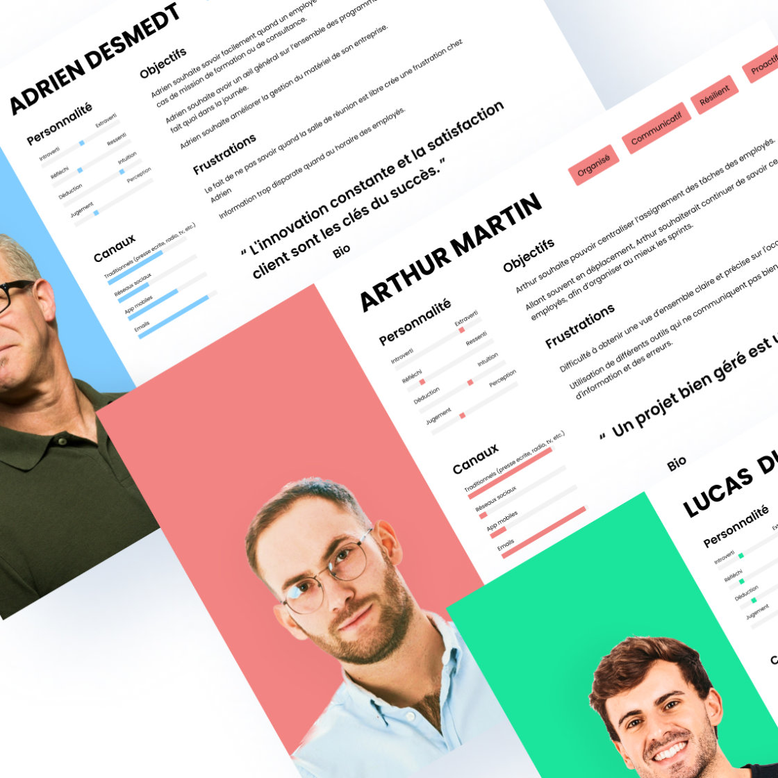
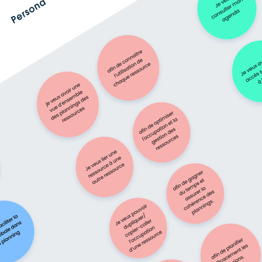
PERSONAS
USER STORIES
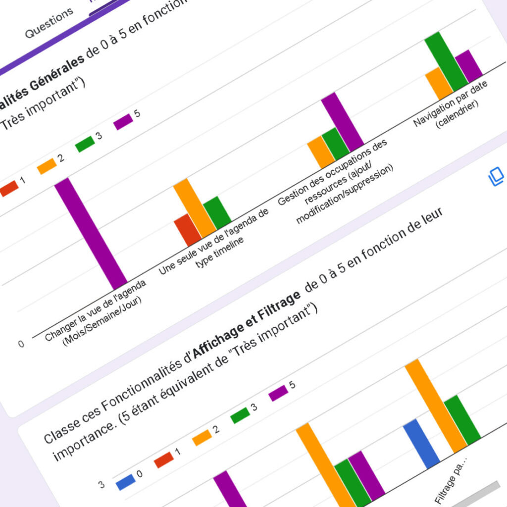
SURVEYS
Research Insights
The main conclusions of the UX research for Skemify highlighted several key user needs and pain points. Users emphasized the importance of having an overview of resource availability and the ability to visualize schedules in both timeline and calendar formats. They expressed a need for real-time conflict detection and automated alerts to manage overlapping tasks and ensure efficient use of resources.
Furthermore, there was a clear demand for intuitive filtering options to quickly find resources by type, project, or occupation. Users also requested a customizable dashboard to view essential metrics, such as the most utilized resources and the time spent on each project or training. Overall, the research revealed that users valued a platform that could simplify planning, provide a comprehensive overview, and enhance team coordination effectively. These insights directly influenced the design choices made in Skemify.
“The ability to plan, adjust, and communicate changes swiftly and efficiently is exactly what I’m looking for in a comprehensive resource management tool.”
Vincent - Project Manager
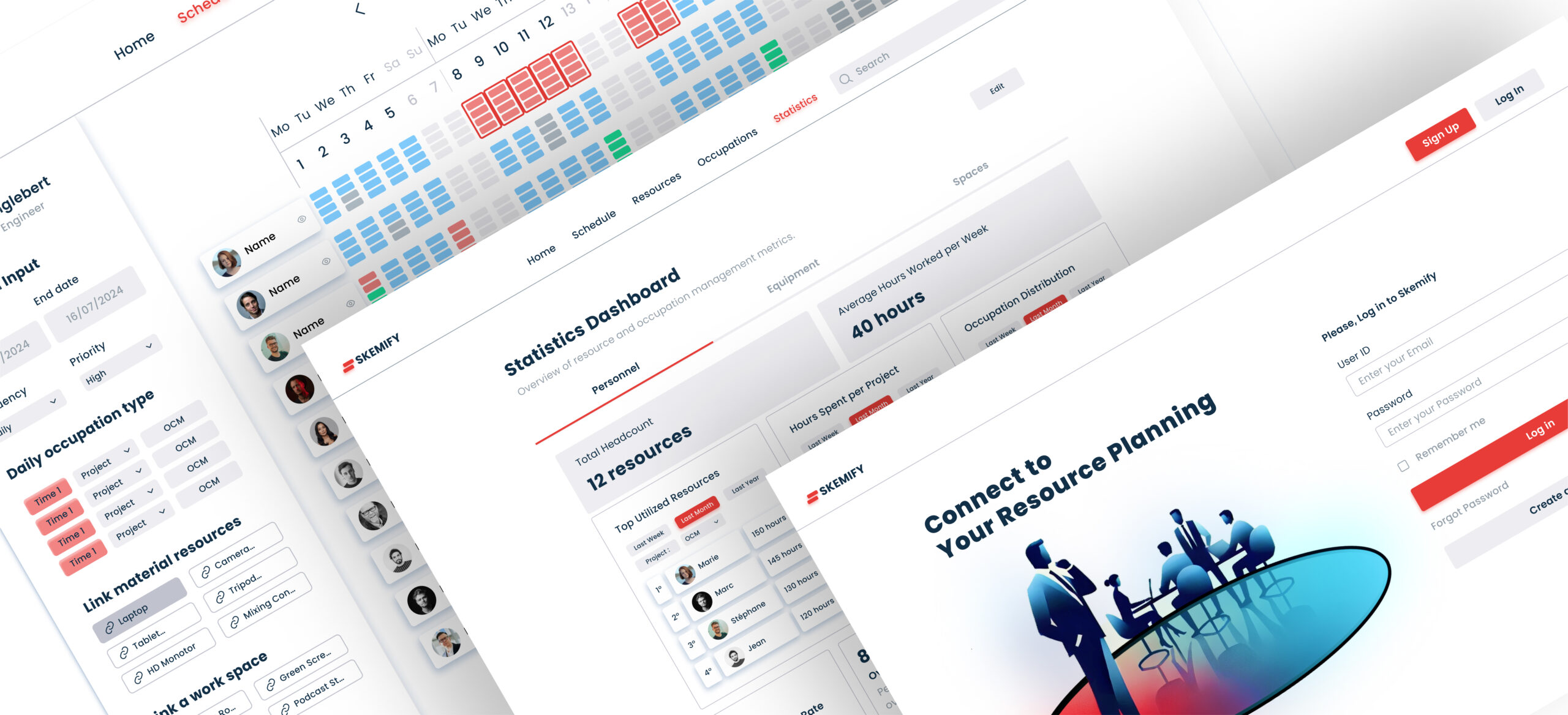
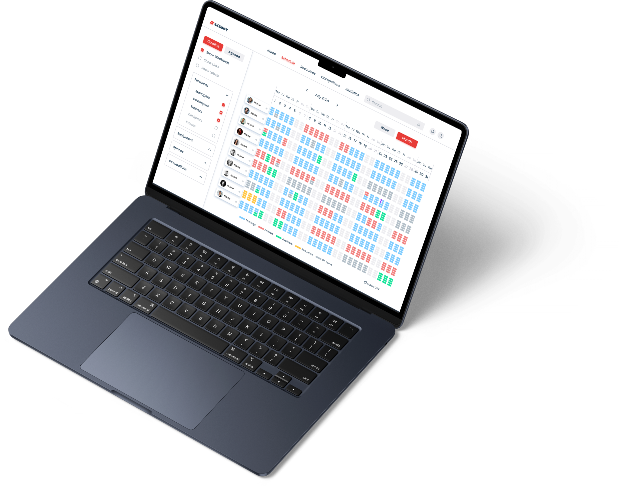
UI Proposal
Prototyping
A key part of my work involved designing every page of the Skemify platform in Figma with a clean and user-friendly interface. I developed a consistent, ergonomic design across all key pages, including the Login Page, Home Page, Resource Management Page, Occupation Management Page, and the Dashboard for statistics.
Each page was carefully crafted to ensure an intuitive user flow, with clearly structured navigation menus, dropdowns, filters, and modals for editing and managing resources. The top navigation bar provides easy access to all the platform’s sections, while key features such as timeline views, filters for resources, and real-time notifications ensure a smooth and efficient user experience.

Design System
I created a handover document for the developers, which serves as a detailed guide to Skemify’s features and functionality. This document outlines every key feature of the platform, from resource management to scheduling and notifications, ensuring that the development team has a clear understanding of the expected user experience. Additionally, it includes the UI design guidelines from the design system, covering elements such as color schemes, typography, component usage, and interaction patterns. This ensures consistency across the platform and helps maintain a seamless user interface throughout the development process.